 |
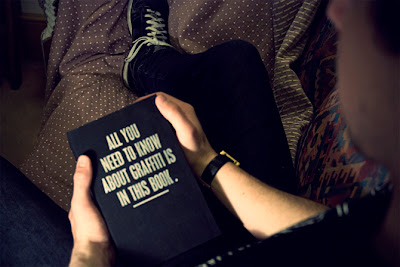
| It does seem just that easy these days. |
Previously my Designer of the week posts have been focusing on Designers that either inspired me to study Graphic Design, or that I discovered while attending University. Well this week I'm looking at a designer I stumbled upon soon after graduating but wished I had known of when starting my first year.
Benoit Ollive is a multitalented designer. Originally from France he is now based in London, a bold step he had hoped would further his career. Benoit originally studied Fine Art and much like many Artists he has looked for other outlets for his creativity, so as not to stifle it. It just so happens he's a natural designer. As a self taught Graphic Designer he chooses to focus his style on making a statement about the urban world and society surrounding him. His designs are culturally aware and very witty in conveying his message. I would not necessarily say his technique is phenomenal but the messages he puts across are strong, interesting, well thought out, and very funny.
 |
| Just like an artist to create something beautiful only to trash it in the end. |
Upon moving to London Benoit hoped to make a statement in the design world and become a notable character. To first achieve this though he knew he had to grab the attention of the studios of London, so he concocted the Throw Bricks Mailer. Using his knowledge of screen printing Benoit created this well designed CV to several studios. He wanted the design to have an impact on the recipient much like a brick through your window create (hence the theme and design of the mailer). A tad aggressive way to say "Hi" to the industry but if he were to throw one through my window I would defiantly remember his name.
As I mentioned Benoit's background may be in Fine Art but he chooses to dabble in many different disciplines. Never one to limit himself or his ideas Benoit also creates: urban paintings, Graffiti, Screen prints, as well as experimenting with photography and ceramics.
 |
| This sculpture is actually a map of one of London's most dangerous areas. |
 |
| A bit of tongue and cheeky with this Urban Art. |
 |
Admittedly not an original idea but Benoit has explored with different
environments and font faces to create some really nice images. |
It is hard to pin Benoit Olive as merely a Designer, he is in fact an artist in its truest form. From the start of every project his focus is on how best to convey his message and opinion, and if this means he must dabble in the other Arts to best express it then so be it.
Truly an amazing and creative mind, Benoit shows us that it is not necessarily the craft to the design that grabs the viewer but the core message behind the design. His messages are silly and fun, and this is how they best connect with the viewer. Take a lesson from him and go create silly and fun designs, it works. I know if I was highering, no matter what my company designed, I would want a mind as beautiful, open and creative as Benoit's on my team.
 |
| An Ice scrapper that helps you get out some of that pent up aggression. |


WOW, thanks for this Colin. I can see why you like him! The 'Life is about forgetting what you learn" is the best one for me.
ReplyDelete